The Color / Image Dropdown Option is an advanced option type that allows merchants to present choices in a dropdown format while still using visual elements like colors or images. This is especially useful when you want to maintain a clean UI while still giving customers a visual understanding of the available options such as styles, patterns, or product variations.
Basic Configuration
This option includes the standard fields used across all option types:
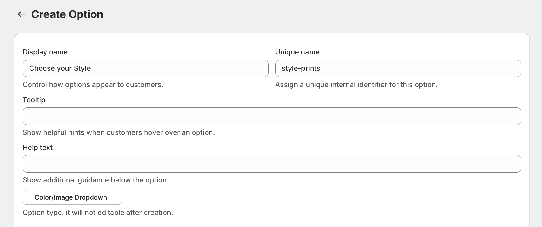
Display Name
This is the label shown to customers on the product page (e.g., Choose your style, Select your design).Unique Name
A backend identifier used internally for managing the option.Tooltip
Displays a small hint when customers hover over the option.Help Text
Additional instructions shown below the option to guide customers.
Advanced Settings
The advanced settings provide flexibility and control over how the option behaves and appears.
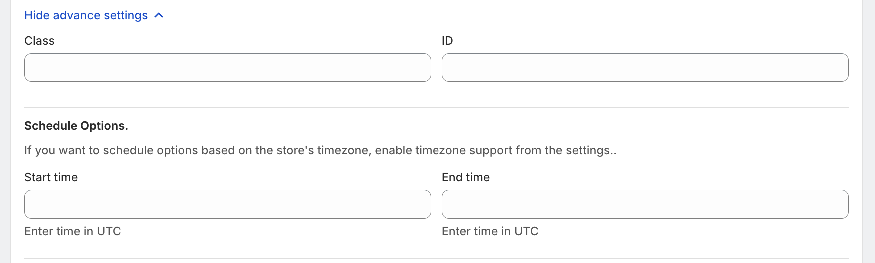
Class & ID
These fields are mainly used for custom styling or developer-level customization.
Schedule Options
Merchants can define a start time and end time for the option.
This allows the option to be displayed only during a specific time period (e.g., limited-time offers or seasonal options).
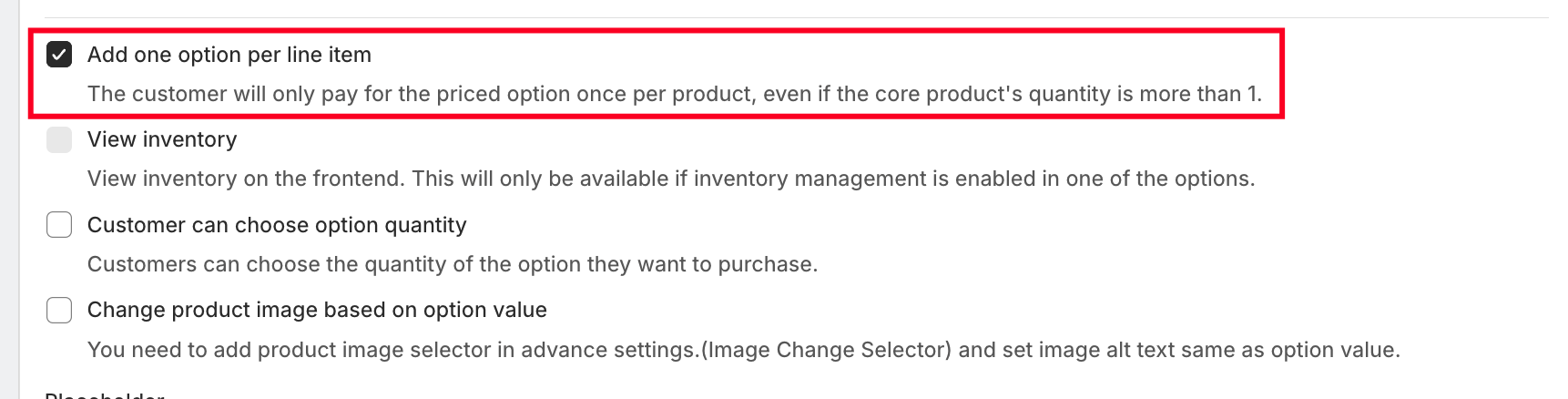
One-Time Charge
When enabled, the price added for this option will be charged only once per product, even if the product quantity is more than one.
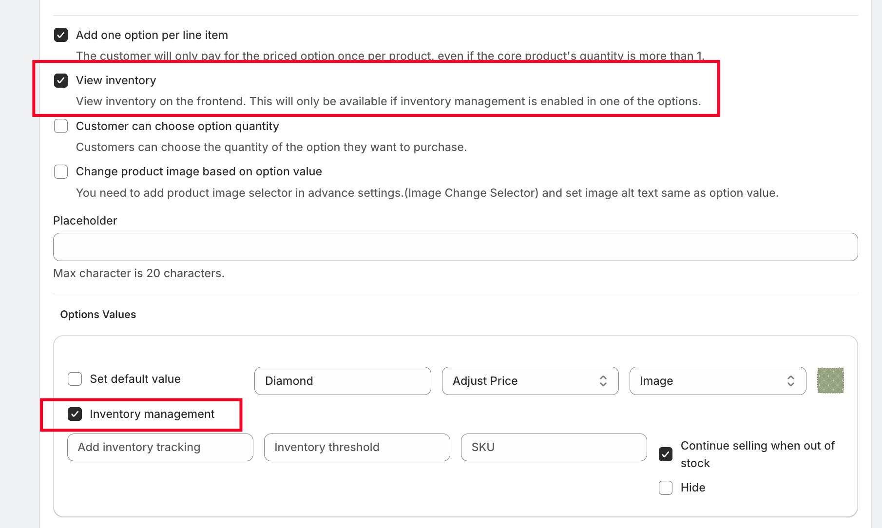
View Inventory on Frontend
Displays the available inventory of each option value directly on the product page.
⚠️ This works only when inventory management is enabled for the option values.
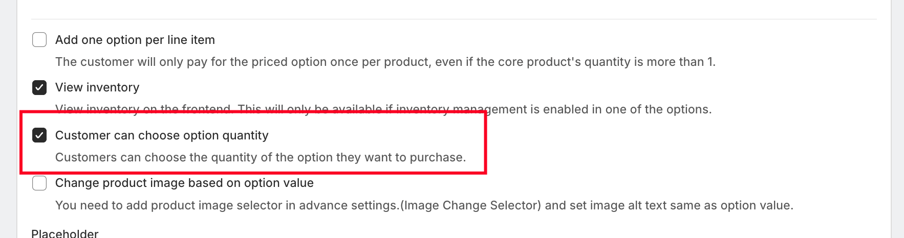
Customer Can Choose Option Quantity
Allows customers to select the quantity for a specific option value, which is useful for add-ons or extras.
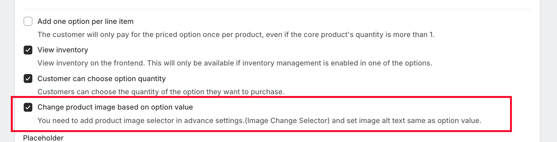
Change Product Image Based on Option Value
This feature dynamically updates the product image based on the selected option.
? Important Requirement:
The alt text of the product image must match the option value name exactly for this feature to work properly.
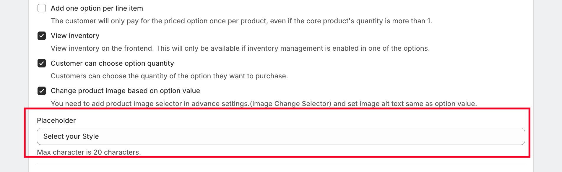
Placeholder Text
You can add a placeholder inside the dropdown to guide users, such as:
Choose your style
Select your design
Pick your color
This improves user experience and clarity.
Option Values Setup
Each option value represents a selectable choice inside the dropdown and can include:
Value Name (e.g., Red, Floral Design, Matte Finish)
Image or Color Representation
Pricing Configuration
Inventory Settings
Default Selection
Pricing Configuration
The Color/Image Dropdown option supports multiple pricing types:
No Charge
The option is free.Custom Charge
A fixed amount is added to the product price.Link Existing Product/Variant
Link existing Shopify variant/product with the Option value.Percentage-Based Price
The price is calculated as a percentage of the main product price.Multiplication-Based Price
The price is multiplied based on the product quantity.
Inventory Management
Merchants can enable inventory tracking for each option value:
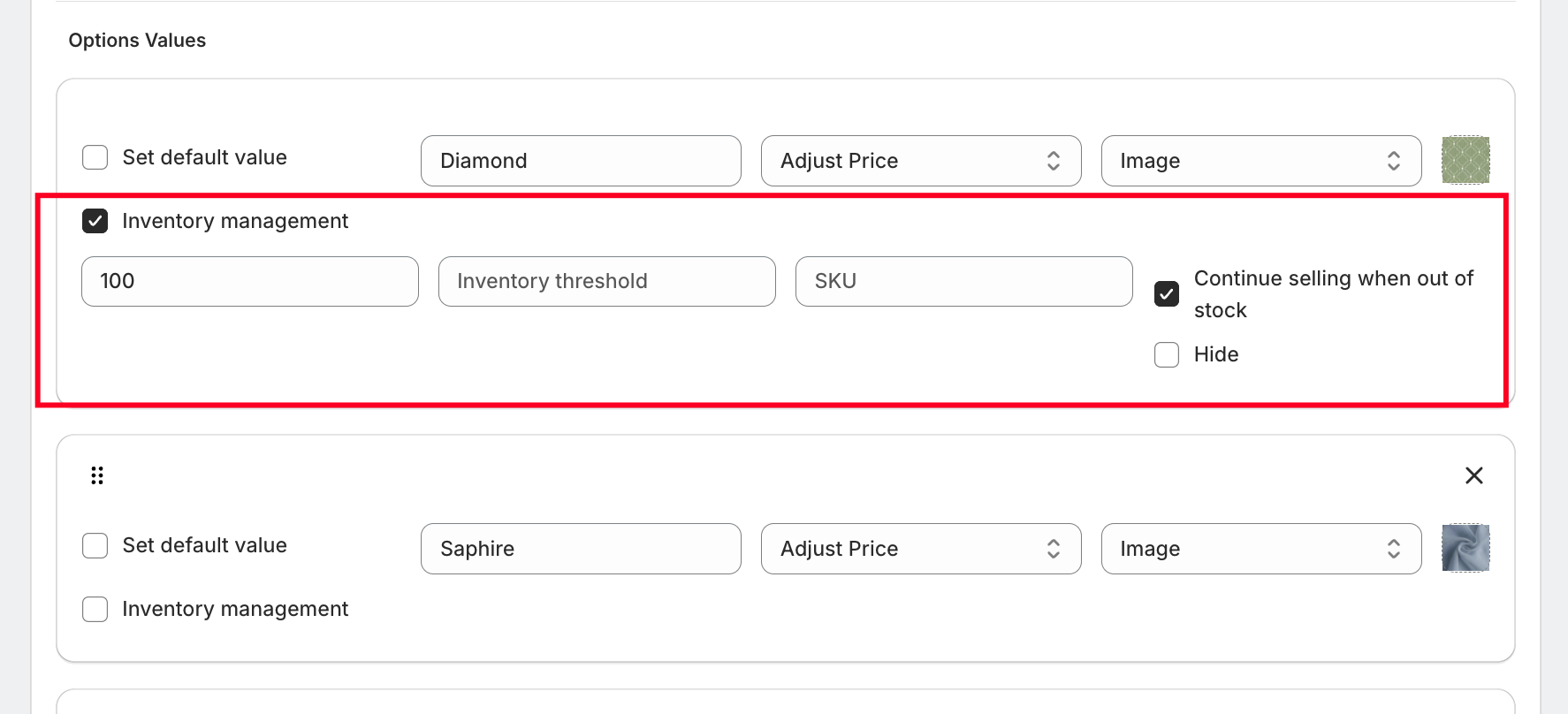
Set available stock quantity
Define an inventory threshold
Assign a SKU for tracking purposes
Stock Behavior Options:
Continue Selling When Out of Stock
Customers can still select the option even if inventory is zero.Hide Option When Out of Stock
The option value will automatically disappear from the frontend.
This ensures better stock control and avoids overselling.
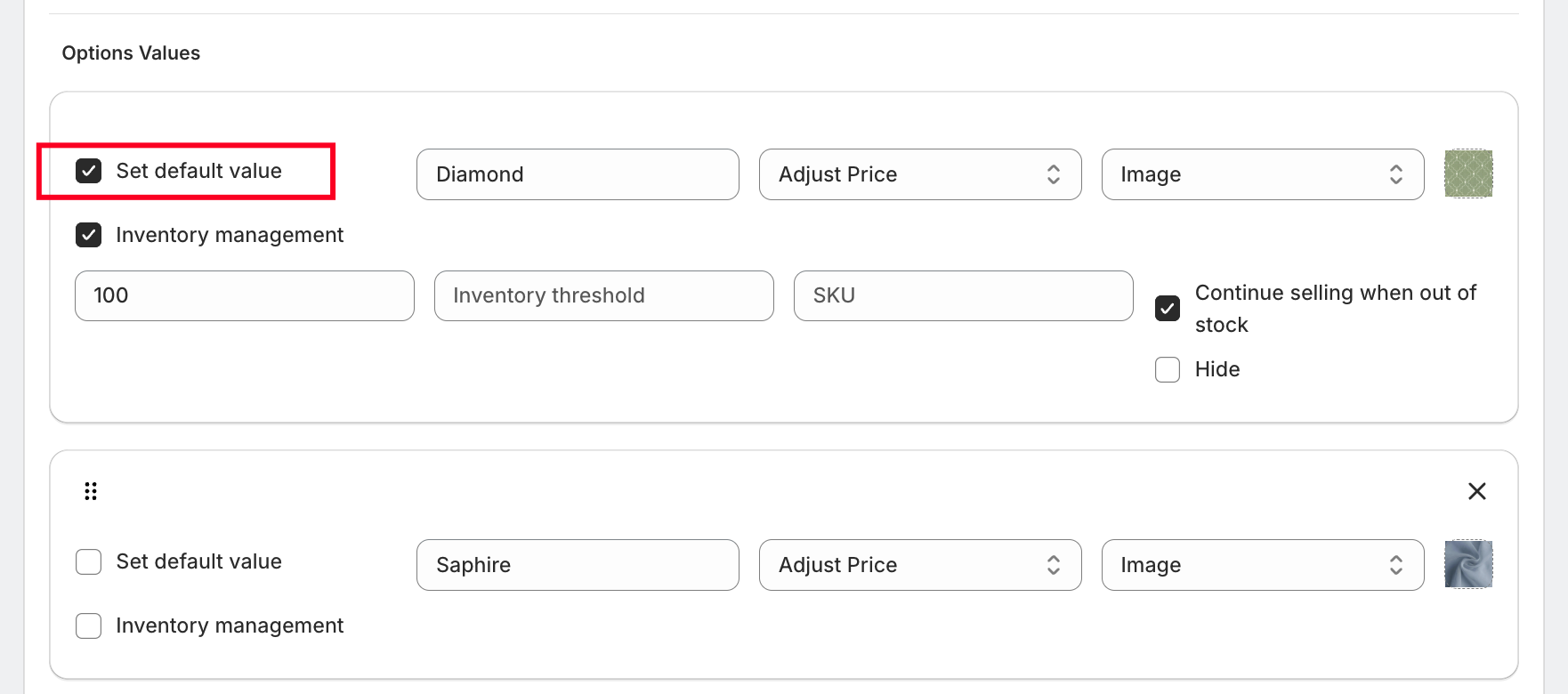
Default Value Selection
You can set a default option value, which will be pre-selected when the product page loads.
This helps guide customers toward a preferred or recommended choice.
Why Use Color / Image Dropdown Option?
Keeps the interface clean and compact using a dropdown
Enhances UX with visual representation (images/colors)
Supports advanced pricing models
Enables inventory tracking per option
Allows dynamic product image updates
Ideal for products with multiple design or style variations
Was this article helpful?
That’s Great!
Thank you for your feedback
Sorry! We couldn't be helpful
Thank you for your feedback
Feedback sent
We appreciate your effort and will try to fix the article